Monday, October 26, 2015

Week 4 - Texture Janani


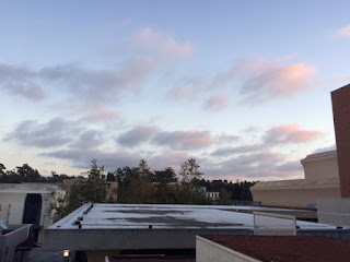
To me in this first picture, the layering of the clouds looked stunning. They were shrouded in pink and it felt breathtaking just looking at something like this. I love how the surroundings are in darkness and the sky alone is lit up in a multitude of colors and textures.


Contrasting that with the picture I took from the lighting coming into my window, where it is dark and then progressively brighter and the lines tend to thin out towards the end which is something I found interesting as to how the light forms thick shadows and then the lines of the shadows thin out and become flat shadow.

Sunday, October 25, 2015

Week 4: Chick Fil A


The arbor over the Chick Fil A  Drive Thru creates a texture/shadow on the side of the building when the Sun shines through it. What I found interesting about this, is that because of the angle of the light hitting the arbor, the arbor casts a diagonal shadow onto the wall, even though the arbor's beams are not diagonal. This is an example of how light can interact with and alter the appearance of sets on stage through angle.

Week Four - Textured Clouds

I just love how these textured clouds texture the textured sky in such a textureless atmosphere all the while texturing the textures of the texture. Texture. 

But seriously. Texture is defined as "the feel, appearance, or consistency of a surface or a substance." With lighting we could perhaps consider the consistency of the light or how light is creating a certain feel or consitency on the surface of the display area. In this image, the clouds are being caught by the setting sun, creating a complex and even calming feel on the late afternoon sky. We can even see some difference in coloration caused by the light as it's being caught by the clouds. Some parts are dark or gray, while others are closer to an off white. The coloration of the sky itself is affected by the clouds, some parts being a light blue, others closer to white. The clouds are having quite the affect on the lighting here and add a great deal to the lighting atmosphere.  


Lighting in Other Places - Texture


I thought this picture brought a really interesting contrast. The sunrise to the right of the image creates a sort of gobo effect across the brick floor, and it adds almost a double layer of texture. The bridge feels more dynamic with the additional lines across it, and from this picture, makes the bridge feel longer than it really is. I find texture a great way to not only set the scene, but also as a way to create more depth on stage. Something fairly close or small suddenly becomes elongated, and the shadows create a nice contrast with the source. A nice change from simply using light on it's own.

Week 4 –– Texture

Nixon Theatre (Oct 25, 2015)
I took this picture at Nixon Theatre when I was designing the sound for the DCP. This texture was coming from the wall of Nixon Theatre and it was very abundant like tree branches. The light was coming from the house light and it laid on the wall smoothly. The peaceful light made the atmosphere of the theatre more comfortable.

Mingna Week 4 (Texture)


I took this picture when my friend was driving on 405. It was almost sunset. The sky looks textured. It seems to be divided into different sections by strips of cloud, and the sky has different blue. There is actually rainbow at the lower middle part of the picture. I feel the sun is like a light with gobo and it gives texture to sky.


Week 4- Texture (Nina Agelvis)


 This Saturday I went to the Irvine Spectrum with my friend Daisy and my boyfriend Jacques. I was so amazed by the ferris wheel because of the projections and the crisp lighting that the LED lights gave off. Compared to the Christmas lights on the palm trees and the ones hanging across the sky, the texture of the LED lights seem sharper and more defiant. the Christmas lights handing across the sky give off a fuzzy amber texture similar to the texture that a Fresnel would give off. I'm not sure if the projection in the middle is created with little LED lights, or projections, but the texture of it is crisper than the LED lights. Maybe because the spacing between each light is different, it gives off a different brushstroke and a different texture. Even comparing the LED lights with the lighting inside the stores on the far end, we could tell that the LED gives off a much brighter atmosphere. Although the photos are not as great as seeing it in person, but it is awesome to see the differences in each of the different lights, through their spacing, colors, and defiant textures.

Friday, October 23, 2015

Sean Deuel Week 4 (Texture)

I found the reflection off of the fountain in the arts quad to give an interesting mix of textures. There is a dual layering of texture here as the pattern of the tree above gets broken down by the ripples in the water. In one of the pictures the pattern of the tree is distorted only a little bit in a few areas while in the other photo the entire pattern seems to be fuzzed in addition to the line going down it creating even more of a break within it.


Monday, October 19, 2015

Week 3 Janani


I tried turning this picture but it refused. My whole idea with this picture was how the sign "Segerstrom Hall" is lit from the bottom up. There is no direct light on the sign but since the letters are made of metal they gleam and have this very warm yet shiny feeling. It almost feels like a sunrise or sunset and has this warmth to it that drew me to it. The same happens on the opposite side so it almost hugs the arch from either side. I just found it interesting that they chose to light it bottom up :)

Sunday, October 18, 2015

Week 2 - Love Janani


I took this picture when I went for a walk around the south lake in Irvine. To me this was nature and lighting at its best because of how the way the light spreads. This is like a painting and you can see that the tent like structure in the center is in the shadow while the sunset envelops and hugs it. It reminds me of the par can that gives bright and warm light from the back. The thing that caught my eye about this picture is how it almost looks like a painting and to me this picture shows love cause of how the light is hugging its surroundings and giving us so much warmth just by looking at this.

Week 3


I took this picture outside of student center. It was a little cloudy, but there was still some sunshine in the afternoon. The sky was still bright. I feel the sky is like a back light or cyc, which gives silhouette of leaves and architecture in the picture. When I took this picture, I was sitting in the shade, so there was not much front light. The upper part of the building is more exposed than the lower part of the photograph, it feels like a side light shining on the upper part of the building.

Week 2 –– Love

Antelope Canyon, Page, Arizona. (11am, 7/3/15)
I took this picture during the last summer vacation. While walking along the small road, I found this heart-shaped hole. The sun was above my head and I could see the sun through the hole. It was amazing that the sunlight traveled through the hole and revealed those line texture. Also, the dark brown color was mixed with the red color that made it looks like chocolate.  I guess when chocolate met heart, it equalled love.

Week 3 - Aldridge Park Seance


Walking along Aldridge Park sometime after midnight, as I do, I come upon an odd little shrine to our dear founder. There's a plaque in on a rock toward the back of the circle in his honor. I'm sure during the day this looks very normal, but to me now, in the middle of the night, it's all very unsettling and reminds me of a  creepy seance.

The effect is a circle of dim lights around an open area. This creates a mix of brightness and shadows on the ground and exposes some texture on in the rocks and cement. It feels almost like a sacred space or place of worship (sacrifice?). It gives me the image of a group of folks calling on the spirit of Aldridge.  


Now compare this image to this. Similar kind of vibe right? :


Week 3: Filling Shadows


While walking I noticed this compostition that can often be found on stage. Coming from one direction was a tinty amber streetlight and from the other side was a tinty flourescent porch light at a much lower angle than the street light. Because the powerful streetlight was at a higher angle it hit a tree that was blocking the light's path to the sidewalk and causing the tree to leave a shadow on the ground. However, instead of just a black shadow being left in its place, the less powerful porch light fills in the black shadow to give it a blue tint, like a tonal. However, the porchlight is not as powerful at the streetlight, so it is not visible anywhere else on the sidewalk. It may appear in the photo that outside of the shadow that the amber and blue tint had blended in someway to make pink, but they haven't my phone has a bad camera. It was originally a very amber color.

This is seen in theatre when there are two lights coming from two directions and the actor casts a shadow and the shadow is filled with another color.

Lighting in Other Places - Homecoming


I absolutely fell in love with the way these clouds were lit. The light from the lowering sun just caught the side of the clouds and just sort of shone through the whole cloud structure (Not sure if that's visible in the picture.) The street was bright though the sun was low, demonstrating just how powerful side light like booms really are. The shadows in the cloud beyond the sunlight just gave the clouds a massive amount of depth, and gave me a "foreshadowing" vibe about on coming rain. It was nice to look up after a long drive to see such a beautifully lit cloud formation, and though it was threatening to rain, it gave such a nice feeling of coming after a long, hot day.

- Caitlin

Saturday, October 17, 2015

Week3- Sweet Delicious Candles

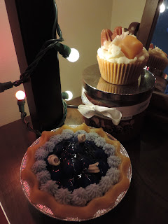
These candles always amuse me on how they look so realistic. Not to mention they smell absolutely delightful. I always thought the Christmas lights complimented all the amber colors of the candles. What turned out to be really interesting in the photo was the half and half lighting in the picture. If you focus on the blueberry pie, you can see how half of it is lit red and the other half is close to white/amber. I'm not quite sure if the coloring of Christmas lights work the same as gels, but it is cool to see how the two colors hardly blend together from each other. I also really like the lighting on the caramel cup cake and how the light gives it more dimension with the shadows and contours it to look even more realistic than it already does. Overall this photo gives me a warm and sweet aura, and the lights just add in more shine and dimension to them. Making them look irresistible!

Week 1 –– Ocean

Inspiration Point, Newport Beach, CA (6pm, 10/16/15)

After riding to Balboa Island, I rode to the Inspiration Point at 6pm. This
place was very charming and the sea wind on my face was very comfortable.
The ocean and the sky were also connected to each other. However, the waves 
differed the sky and the ocean. This scenery reminded me to set the cyc lights 
with a slight color difference when I was creating the background, especially 
for the outdoor scene. When the sunset came, the beam of sunlight cut the 
connection and separated them. 

Inspiration Point, Newport Beach, CA (6pm, 10/16/15)


Week 3 –– Leaving

Balboa Island, Newport Beach, CA (5pm 10/16/15)

I took this photo at Balboa Island when I was riding my bike. The sky was cloudy and I could barely see the sunlight. The position of those boats brought me a great sense of pushing forward like (the function of the front center light) they were leaving (though they were not moving) and floating in the sky. Also, the light came in on the surface of the river that created more texture. I wish there was less wind on that day because the shadows of the boats were destroyed by the wind. However, I wonder if the lights on the theater could create a floating shadow? The colors of the sky and the river were merging together that made me feel peaceful and relaxed. 

Friday, October 16, 2015

Sean Deuel Week 3

I had never really taken the time to analyze how clouds effected lighting until today. Today there was a light but full cover of clouds. The clouds diffused the light from the sun, making it dimmer and a grey, but also making it less defined. While the ground under the trees in this picture is darker than the ground in the open, the shadows of the tree are not defined enough to really say that any one area is in shadow while another is not. Also in class we are often talking about finding the source, but with cloud cover there is no clear light source.