Sunday, December 6, 2015

Week 10- The Block


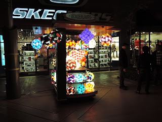
It is kinda sad to see that everyone got to have such festive photos from the Spectrum and here I am with boring photos from The Block. Unlike the Spectrum, The Outlet of Orange (The Block) has less festive outdoor lighting, majority of it is just for practicality and visibility. You can even tell that a few of the light-bulbs from the ornaments are broken. In the photo it seems dim, but in person the hallway is pretty well lit. The street lamp creates a slight isolation for the outdoor stands. I feel like the different lights coming from the store names brings more variety and color, such as Dave & Buster's. The open restaurants create the festive atmosphere. The people walking pass the stores are able to hear music and have their attention drawn towards the bright neon lights. Without the open restaurants the practicals are just used for visibility. Because the paths are so plane and dull, the store's large signs can be used as a way to attract the customer's attention. 


Old Navy
I absolutely hate all Old Navy stores. The use of florescent lights and practicals shinning brightly in the room does not give any welcoming atmosphere at all. It feels like I'm just stepping into an open warehouse. It does not emphasize on the clothing's texture or have a specific spot light to attract the customers. Although I do agree that the dull interior lighting goes well with their dull simplistic clothing. The store does not scream "elegance" or "expensive", it screams "cheap" and "simplistic". Overall in my perspective the designers failed to sell their product. They should have used different intensities of light to attract the customers to special offers.     


Victoria Secret
 Victoria Secret has always been a store that captured the sexiness of their product with the use of dark colors such as black, and bright saturate colors such as pink. I have seen way fancier Victoria Secret stores compared to this one, but they still do a better job at showcasing their newest product. The new products are placed on a pedestal for everyone to see. Lights focus on that one area to isolate the product. Similar to Old Navy, the store does not use any colored lighting, but Victoria Secret uses the difference in intensity to emphasize on their newest products. Each product is shaped and shaded nicely with shadows. Although I personally would not have placed the white bra on the very top because the light is shinning brightly at it, the white blends in with the manikin. The white bra would have had more texture if it were to replace the green bra or the pink one. Over all they captured the importance of the product and the elegance of it. Seeing it in person you could see the shadows emphasizing the texture of the bras.

Overall this was a very fun experience to look at lights that are not designed theatrically. It was very difficult walking around with a camera taking photos, because most stores did not allow any photography. I was glad I managed to snap a few photos before I left the stores. Good luck on finals guys! I am so happy to be able to learn so much in this class! Thank you!


Trey's Final Blog - The Lab

The Lab. It's a very cool and hip mall in the very cool and hip part of Orange County. It just screams hip. It wants you to KNOW how cool it is. It's like that friend you have that knows all the latest bands and only watches black and white French movies. But they also happen to have a lot of great and random recipes for things like apricot/hazel scones and coconut chicken curry, so you hang out with them anyway. (This metaphor is implying that the Lab has great restaurants, which it does.) 

The whole store has a sort of "Do it yourself feel" and everything feels hand crafted or community made. There's two or three entrances to the mall, but my favorite is this one that has hundreds of plastic light bulbs around a green garden. The look reminds me of a friend of mine who actually had a DIY wedding this summer. They had very similar decorations. 


I went during the day, so some of the effect of the many lights was lost. I feel like the whole effect would be very magical if seen at night as much of the mall is covered in plastic and glass light bulbs.


But the daylight offers some interesting tricks as well. Much of the store is open air (very So-Cal) and there are sky lights throughout. Like this one that cleverly has the name of mall written in the ceiling.


The store I thought captured the overall DIY / handmade aesthetic the best was the store H&H (Heirlooms and Hardware), which sells mostly antiques and weird things sold by local artists. I bought a notebook that was designed to look like a vintage children's book. (Weird I know.)


The clerk in the store was very friendly and didn't seem to mind me taking odd photos. What I thought was cool was that the store felt like it was entirely lit by these vintage light coiled light bulbs. AND ... The light bulbs are all for sale!


But look! There's a sneaky florescent light assisting all those light bulbs! In reality, this light must be doing most of the heavy lifting of lighting the store.


A store that was a little less effective was was Urban Outfitters. First thought: What's Urban Outfitters even doing in the hipster haven? Urban Outfitters is like the Whole Foods of hipster attire. The give the illusion of caring about culture, but in reality the just want your money. All of your money. That store is so expensive. Meanwhile, the poor owners of H&H are trying to put their kids through college by selling novelty light bulbs and note books that are designed to look like vintage children's books.

I digress: I will say that Urban Outfitters blends itself well to the overall hipster aesthetic of the mall, but it fails to provide the same DIY / homemade look of the H&H Store. First there is a very fancy neon looking sign above the entrance. Second the store relies less on interesting hanging lights for decoration, and instead the store was lit almost entirely by the hanging florescent lights we saw supporting the bulbs in the H&H. The store did have a few hanging lights, but the were too industrial looking to me to be of much interest.


So, avoiding the money pitt that is Urban Outfitters, The Lab is a very interesting and eclectic mix of stores and styles worth exploring.


Sean Deuel Week 10 (Spectrum)

For my site specific blog I went to Irvine Spectrum. I found the various locations of use for lighting to be very interesting. In many cases there was a high use of color in the lighting. The ice skating rink and ferris wheel were filled with various colors emphasizing the feeling of fun and festivities. At the same time, there are other sections of the mall that use a much simpler lighting of an uncolored light to emphasize the "classy" look of the sculptured architecture. I found this mixing of style to be very enjoyable as it opens up the area to have something for everyone. There is bright and showy for those who want that or a calmer glow for others, and a spectrum of others in the middle.

 The first store I want to look at it is Jeannie and Mini Baby Boutique. I did not feel comfortable taking pictures of the inside of this store, but I tried to capture the lighting in this photo. The store is relatively dimly lit by amber incandescent lights in shades. I imagine that the designers of the store were aiming to achieve a soft comforting light to match the feeling that you want a baby to feel. While I feel that they achieved this feeling, the lighting does not work for me because it does not see the product. Many of the items in the store are bright colors (solid reds, blues, and other colors), but the lighting fails to capture this, instead muddying all of the colors together.


The other store I want to discuss is the Sunglass Hut. This store is filled with bright white light, reflecting off of white walls and a white ceiling. I feel the design for this store was less based on a feeling they want to present and more on functionality. The product of sunglasses is all about filtering out light, so how can the customers know the product works without light to filter. I can not claim whether or not the lighting benefits their sales, but if the sunglasses work then I imagine it would as the contrast becomes visible.

Week 10 Spectrum

I went to Irvine Spectrum for this final blog. The overall feeling of the mall is happy, bright, colorful, and festive. Most of the trees are wrapped by yellow LED strings. The lighting design feels great when I first walk in, but after a while, my eyes get tired because the the lights in the mall are very similar.
American Apparel has good lighting design. The neon lights at the front door is fun and it pops up. It contrasts with the white wall inside the store. The lighting inside the store is bright. The place feels vibrant, and it attracts customers to go in.

I find the lighting at Urban Outfitters is not a very efficient design. The lights are white and industrial. The lights did not guide my eyes where to look at. The lights are spread evenly in the store, so there is no any focus on anything. I just see many clothes in the store, but it does not attract me to continue walking in and the clothes do not look interesting under this dull lighting. I assume the LED strings are installed for the holiday theme, but the white lamp and the yellow LED strings do not fit well with each other, and it does not change the dull look very much.

Week 10 –– Irvine Spectrum Center

Irvine Spectrum Center (7pm, 12/5/2015) - Long Exposure
Irvine Spectrum Center is a pedestrian mall that provides shopping, dining, and entertainment. Its overall atmosphere is relaxing and Christmasy in December. When I was walking on its street and exploring different stores last night, I felt its lights were great to provide visibility for the customers: they were neither too bright nor too dark. This mall also had many yellow and red lights to increase the Christmasy atmosphere. However, these lights didn't make me want to buy more things in this mall, because different stores had their own lighting styles and they didn't match the overall lighting. And the contrast among them were so obvious that took away my willings to purchase something.

Lucky Brand

Lids Locker Room
This store really captured my eyes when I walked by. Lucky Brand's lighting was soft and Christmasy. The clothes inside this store was organized. This store was decorated with green belts and yellow light bulbs. The small light bulbs were like stars that created a romantic environment. The imperfect indigo light under the blue brand light was very interesting and it seemed to lead me into this store. So I thought this store's lighting was very successful.


Lids Locker Room's lighting was not very successful because it just had some boring bright white downlights to light the store. This store sold sports outfits and it should be energetic. However, I just felt sleepy to look at its clothes. Its clothes were not organized by their colors and they just randomly hung in different places. When I walked by this store, I wouldn't pay attention to it.
Cheesecake Factory
Cheesecake Factory had a great lighting. It had colorful lights on the ceiling and warm lights on the wall. The intensity of these lights was not strong that it created shadows on almost every guests' faces. This helped the guests stay low and focus on their food or private conversation. If I went to this store, I would eat more. However, it was funny that two people pointed at me when I took this picture.