Week 10- The Block
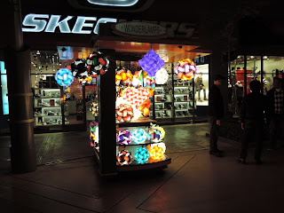
 It is kinda sad to see that everyone got to have such festive photos from the Spectrum and here I am with boring photos from The Block. Unlike the Spectrum, The Outlet of Orange (The Block)
has less festive outdoor lighting, majority of it is just for practicality and visibility. You can even
tell that a few of the light-bulbs from the ornaments are broken. In the photo it
seems dim, but in person the hallway is pretty well lit. The street lamp creates
a slight isolation for the outdoor stands. I feel like the different lights
coming from the store names brings more variety and color, such as Dave & Buster's. The open restaurants create the festive atmosphere. The people walking pass the stores are able to hear music and have their attention drawn towards the bright neon lights. Without the open restaurants the practicals are just used for visibility. Because the paths are so plane and dull, the store's large signs can be used as a way to attract the customer's attention.
 |
| Old Navy |
I absolutely hate all Old Navy stores. The use of florescent lights and practicals shinning brightly in the room does not give any welcoming atmosphere at all. It feels like I'm just stepping into an open warehouse. It does not emphasize on the clothing's texture or have a specific spot light to attract the customers. Although I do agree that the dull interior lighting goes well with their dull simplistic clothing. The store does not scream "elegance" or "expensive", it screams "cheap" and "simplistic". Overall in my perspective the designers failed to sell their product. They should have used different intensities of light to attract the customers to special offers.
 |
| Victoria Secret |
Victoria Secret has always been a store that captured the sexiness of their product with the use of dark colors such as black, and bright saturate colors such as pink. I have seen way fancier Victoria Secret stores compared to this one, but they still do a better job at showcasing their newest product. The new products are placed on a pedestal for everyone to see. Lights focus on that one area to isolate the product. Similar to Old Navy, the store does not use any colored lighting, but Victoria Secret uses the difference in intensity to emphasize on their newest products. Each product is shaped and shaded nicely with shadows. Although I personally would not have placed the white bra on the very top because the light is shinning brightly at it, the white blends in with the manikin. The white bra would have had more texture if it were to replace the green bra or the pink one. Over all they captured the importance of the product and the elegance of it. Seeing it in person you could see the shadows emphasizing the texture of the bras.
Overall this was a very fun experience to look at lights that are not designed theatrically. It was very difficult walking around with a camera taking photos, because most stores did not allow any photography. I was glad I managed to snap a few photos before I left the stores. Good luck on finals guys! I am so happy to be able to learn so much in this class! Thank you!


Really great detail and commentary! Definitely agree that this particular area hasn't exploded with money and wealth, but you're right, the bright store signs are both functional and fun. And there are definitely quality/design differences in Old Navy and VS! VS has a slightly warmer color temp as well, which adds to the class too. Nice!
ReplyDelete